Single vs Double Mat: A Custom Framing Design Guide
The mat is the quietest decision in a frame and often the one that decides whether the finished piece looks considered or improvised. Customers tend to fixate on the moulding because it is the obvious, visible band of colour and texture. But the mat is doing more work in most cases: it sets the proportion, gives the eye somewhere to rest before it reaches the art, and physically protects the piece. Get the mat right and a modest print can look like it belongs on a gallery wall. Get it wrong — too thin, the wrong colour, the wrong number of layers — and an expensive moulding cannot rescue it.
This guide is about that decision: when a single mat is enough, when a double mat earns its extra cost, and when a triple mat tips into excess. It is written for framers building quotes at the bench and for anyone who wants to understand what they are paying for. We will cover what a mat does, how borders and reveals are sized, how colour and material choices change the result, how those choices feed directly into the price, and how to show options to a customer rather than describe them.
What a mat actually does
Before choosing one mat or three, it helps to be clear on the job the mat is performing. There are three distinct functions and they are sometimes in tension.
Visual breathing room
A mat creates space between the artwork and the frame. That space is not decorative padding — it is the buffer that lets the eye settle on the image before the moulding interrupts it. Without it, the frame crowds the art and everything competes for attention. This is why even a small print can warrant a wide mat: the proportion of empty board around the image signals importance.
Physical separation from the glazing
A mat lifts the glass off the surface of the artwork, and this matters more than most customers realise. When paper sits directly against glass, moisture trapped between the two can cause the image to stick to the glazing — known as ferrotyping on photographs — and condensation in a temperature-swinging room can foster mould or buckling. The thickness of the mat board creates an air gap that prevents direct contact and lets the piece breathe. If a design genuinely calls for no visible mat, a framer will use spacers hidden under the rabbet to achieve the same separation. The principle is non-negotiable for anything worth conserving.
Setting proportion and weight
The mat establishes the relationship between the art, the frame, and the wall. A wide mat slows the composition down and makes it feel formal; a narrow mat makes it feel tight and contemporary. The border width is a proportion decision as much as a protection decision, and it interacts with the scale of the moulding. A heavy frame with a skinny mat looks unbalanced; a delicate frame with an enormous mat can look precious. The mat is the negotiator between the two.
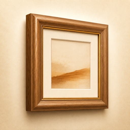
Single mat: the foundation
The single mat is the default and, for a great many pieces, the correct answer. Knowing how to size one well is more valuable than knowing twenty exotic techniques.
Border width conventions
There is no single rule, but there are reliable starting points:
- Small works (up to roughly 8x10): a border of around 2 to 2.5 inches usually reads well.
- Medium works (11x14 to 16x20): borders of 3 to 3.5 inches give a confident, gallery-leaning result.
- Large works: borders can grow to 4 inches or more, scaling with the piece so the proportion holds.
The instinct to use a thin mat to “save board” almost always weakens the result. A mat that is narrower than the frame’s face often looks like a mistake. When in doubt, go wider than feels comfortable — restraint here usually means too little, not too much.
Bottom-weighting
A classic refinement is bottom-weighting (also called weighting the bottom). The mat borders are not equal: the bottom border is cut slightly larger than the top and sides — commonly a quarter to half an inch more on a standard piece. This corrects an optical illusion. With four equal borders, the bottom appears to be the smallest because of how the eye reads vertical space, and the art looks like it is sinking. Adding weight to the bottom restores visual balance and gives the piece a sense of standing upright on a base. It is a small move that separates professional matting from kitchen-table framing. Bottom-weighting is most appropriate for fine art, certificates, and anything formal; it is sometimes skipped for grids of identical pieces where equal borders read as deliberate.
Proportion to artwork and moulding
A single mat should be sized in conversation with both the art and the frame. Three quick checks:
- The mat border should generally be wider than the visible face of the moulding, so the frame does not overpower the breathing room.
- The mat colour should not compete with the dominant tones of the artwork.
- The opening should be sized so a sliver of the artwork’s edge is covered (an overlap of about a quarter inch), unless you are floating the piece to show its full edges.
Get these three right and a single mat will carry most work beautifully.
Double mat: the reveal explained
A double mat is two mats stacked, with the top mat cut to a slightly smaller opening than the bottom mat. The strip of the bottom mat that shows through is called the reveal (or the liner). This narrow band of a second colour is the entire point.
What the reveal does
The reveal is a fine line of accent that frames the artwork before the main mat begins. Visually it does three things: it creates a crisp inner edge, it introduces a second colour or tone that can be pulled from the art, and it adds a subtle sense of depth because the bottom mat sits a board-thickness lower than the top, catching a shadow line that makes the composition feel layered rather than flat.
Typical reveal sizes
The reveal is measured as the width of the bottom mat visible between the two openings. Common sizes:
- 1/8 inch — the most common and most versatile; a clean, confident line that suits almost anything.
- 1/4 inch — a bolder statement, good when you want the accent colour to register clearly from across a room.
- 1/16 inch — a whisper of a line, elegant on delicate works on paper but demanding precise cutting.
The reveal must be cut accurately and consistently on all four sides; an uneven reveal is one of the most visible faults in framing, far more noticeable than a slightly off mat colour.
Why a contrasting or accent reveal lifts a piece
A neutral top mat with a contrasting reveal is the most reliable way to make a piece look intentional. A cream mat with a deep navy reveal, a soft grey mat with a warm gold reveal, a white mat with a thin black line — each adds polish without shouting. The reveal lets you introduce a colour from the artwork as a thread of accent without committing the whole mat to it, which would risk overwhelming the image. It is the framing equivalent of a pocket square.
When a double mat is worth the added cost
A double mat is justified when:
- The artwork has a strong accent colour you want to echo without dominating.
- The piece is going somewhere it needs to read as finished and considered — a commission, a gift, a feature wall.
- The single-mat version looks slightly flat and you want depth without a heavier frame.
- You want the art separated from the glass by an even larger air gap (two boards instead of one), which is a genuine conservation benefit for valuable pieces.
It is not always worth it. For a casual print, a set of matching pieces on a budget, or anything where the second colour does not clearly serve the image, a well-sized single mat is the more honest recommendation. Adding a second mat purely to raise the ticket is a habit that erodes trust.
Triple mats and when to stop
A triple mat adds a third board and a second reveal. Done well — a stack that steps from cream to a thin gold reveal to a thin deep-blue reveal — it can give a piece real ceremony, and it is traditional for diplomas, military awards, and pieces with metallic accents. Done carelessly it looks busy and dated.
The rule of restraint applies hard here. Each additional reveal must justify itself with a colour the artwork actually contains or a deliberate formal effect; three reveals of arbitrary colours is noise. As a guideline, most work needs no reveal, a good amount benefits from one, and only a minority truly earns two. When you find yourself adding a third mat to fill space rather than to serve the image, stop at two.
Colour and material choice
The number of mats is only half the decision. What the mats are made of, and what colour they are, matters at least as much.
Neutral versus accent
Most matting should be neutral: whites, creams, soft greys, warm off-whites. A neutral mat disappears and lets the art speak, which is almost always the goal. The mistake beginners make is choosing a coloured mat that matches the room’s décor — a sage green mat for a green sofa, say. Décor changes; the framing should serve the artwork, not the upholstery. Reserve strong colour for the reveal, where a thin band can echo the art without competing with it.
When you do pull a colour from the artwork for a reveal or an accent mat, pull one that is present in the art but not dominant. Echoing the dominant colour tends to flatten the image; echoing a secondary colour makes that note sing. The Color Palette Safari extension is useful here: open a high-resolution image of the artwork, extract its palette, and you have an objective reading of the secondary tones to consider for a reveal rather than relying on memory or a swatch held under shop lighting.
Decorative versus conservation boards
Mat board is not all the same, and the difference is about chemistry as much as colour.
- Standard (decorative) mat board is wood-pulp based. It is buffered and acceptable for everyday work, but over years the lignin in wood pulp can yellow and, worse, leach acid into the artwork — the brown bevel-line “mat burn” you see on old framing is exactly this.
- Acid-free / conservation board is treated to neutralise acidity and is the sensible default for anything worth keeping. The bevel stays white and the artwork is protected from the mat itself.
- Rag / cotton museum board is made from cotton fibre rather than wood pulp, is inherently acid-free and lignin-free, and is the correct choice for original art, valuable photographs, and anything destined for long-term conservation. Its cut bevel is also exceptionally clean and white, which looks superb as a reveal.
Be honest with customers about this. A poster of a band does not need cotton museum board. An original watercolour or a signed photograph absolutely does, and explaining why — that the cheaper board can stain the art over a decade — is the kind of advice that earns repeat business.
Texture and surface
Beyond colour and conservation grade, mats vary in surface: smooth, suede, linen-wrapped. Texture can add quiet richness, particularly on a single mat where it is the only mat decision you are making. A linen-textured cream mat reads as more luxurious than a flat one without introducing any new colour. Use it sparingly, and never let it compete with the art’s own surface.
Techniques worth knowing
A handful of specialised mat techniques expand the toolkit. You do not need them on every job, but knowing when they apply marks an experienced framer.
- V-groove: a thin V-shaped channel cut into the face of a single mat, a set distance in from the opening, revealing a fine white line of the board’s core. It adds a delicate accent without the cost of a second mat and is elegant on formal pieces.
- Fillets: a small moulding (like a tiny frame) set inside the mat opening, sitting against the art. A fillet adds a slim line of carved or gilded detail at the edge of the image and can bridge the mat and the main frame.
- Float mounting: instead of the mat overlapping the edges of the artwork, the piece is mounted on top of the board so its full edges — including any deckled or hand-torn edge — are visible, often with a shadow gap around it. This suits art where the edge is part of the work, and requires spacers to keep the glass off the surface since there is no mat opening doing that job.
- Multiple openings: a single mat cut with several windows for a set of related pieces — a sequence of photographs, a collection of postcards, a series of prints. Spacing and alignment have to be exact, which is where careful planning pays off.
Each of these is a design lever, not a default. Reach for them when the piece asks for it, not to demonstrate that you can.
Cost: design choices are pricing choices
Every mat decision is also a money decision, and being clear-eyed about this protects both your margin and the customer’s trust.
Matting is typically priced by united inches — the width plus the height of the piece — which is why a large mat costs disproportionately more than its area might suggest. Each additional mat in the stack adds two things to the bill: material (another board, more so for cotton museum board than standard) and labour (another opening to cut accurately, plus the bottom mat to register and mount under the top one). A double mat is not twice the price of a single, but it is meaningfully more, and a triple more again. For the underlying logic of how united inches drive the matting line, the companion piece United-Inch Pricing Explained for Framers walks through it in detail.
The honest framing of this for a customer is straightforward: a double mat is a design upgrade with a real material and labour cost behind it, not an arbitrary surcharge. When the reveal genuinely improves the piece, that is easy to justify. When it does not, recommending the single mat and the saving is the right call — and customers remember it. Conservation board is a similar conversation: it costs more because it is a better material that protects their art, and the value is real, not invented.
Because each of these choices moves the price, you want to see the cost consequence as you design, not after. Switching from a single to a double mat, nudging the reveal from 1/8 to 1/4 inch, or upgrading from standard board to cotton rag should each show up immediately on the running total. Designing blind and pricing afterwards leads to either eroded margin or an awkward conversation when the number lands.
How to present mat options: show, don’t tell
The single biggest improvement most shops can make to mat selection is to stop describing options and start showing them. A customer cannot picture “a double mat with a one-eighth-inch deep blue reveal” from words. They can react instantly to seeing it.
Why showing beats telling
Mat colour, border proportion, and reveal width are all visual judgements. Held against the actual artwork, the right combination is usually obvious within seconds, and so is the wrong one. The conversation shifts from you persuading the customer to the customer choosing for themselves — faster, more satisfying, and far less likely to end in a remake. It also lets you upsell honestly: when a customer sees the double-mat version next to the single, the better option often sells itself, and if it does not, you have lost nothing.
Building a reference library
It helps to keep a library of past jobs and inspiration to draw on — colour pairings that worked, reveal sizes on different scales, how a particular board looked on a particular type of art. Saving reference shots as you go builds an in-house lookbook you can pull up in a consultation. A quick capture-and-organise tool such as SnapMark keeps these reference and inspiration images tidy and findable rather than buried in a camera roll. When a customer is unsure, showing two finished pieces from your own past work that solved the same problem is more persuasive than any swatch fan.
A digital proof at the counter
Physical corner samples are the traditional method and they work, but they only show a small corner and they cannot show the customer’s own image inside the chosen mat. A to-scale digital proof closes that gap, and this is where Mitre fits the workflow. It is a native, fully offline picture-framing app for iPhone, iPad and Mac that lets you compose a frame on screen: choose single or double mats, set the reveals, pick the glazing and a moulding from your own catalogue, and drop in the customer’s actual photo so they see a live, to-scale proof — mat reveals shown with a cut bevel and the real image inside — while it prices the job from your catalogue, including united-inch matting.
The value at the counter is twofold. First, the customer sees their image in the proposed mat treatment and reacts to something real, not an abstraction. Second, because Mitre prices the job as you design it, switching between a single and a double mat or adjusting the reveal updates both the proof and the price together — so the design conversation and the money conversation happen at once, with no surprises when the quote prints. It then produces a one-tap quote PDF and a shop cut-sheet that carries the exact mat openings and sizes to the bench, so the design agreed at the counter is the design that gets cut. Mitre works entirely offline, with no account, cloud, or subscription, and supports conservation and museum glazing tiers in inches or centimetres.
Once a customer has approved a proof, exporting it as a tidy document for their records is easy too — a tool like Photo to PDF can wrap a proof image into a clean PDF if you want a record outside the framing app. For shops juggling multiple consultations and pickups, keeping the appointments straight with something like My Agenda Planning keeps the front of house calm enough that the design conversation gets the attention it deserves.
Bringing it together
The mat is not an afterthought to the moulding; it is the part of the frame that does the design thinking. A well-sized single mat, bottom-weighted, on conservation board, will serve the large majority of work and should be your default recommendation. A double mat with a considered reveal is a genuine upgrade when the artwork offers a secondary colour to echo or when the piece needs depth — and it carries a real, explainable cost. A triple mat is for the minority of formal pieces that truly earn a second reveal. Colour should stay neutral on the main mat and save its boldness for the reveal; material should match the value of what is being protected.
The thread running through all of it is restraint informed by knowledge: know what each technique does, use it only when the piece asks for it, and show the customer rather than describing. To see how matting sits within the wider toolkit a modern frame shop runs on, the hub guide Best Apps for Picture Framing and Frame Shops maps it out, and the companion pieces on measuring artwork accurately and choosing glass and glazing cover the other two decisions that, with matting, make up the heart of every custom job. If you run a shop and want a wider view of the tools that keep a small framing business organised, the roundups on apps for small business owners and apps for content creators are a useful starting point.
Frequently Asked Questions
What is the difference between a single and a double mat?
A single mat is one board with a window cut for the artwork. A double mat stacks a second board underneath, cut to a larger opening, so a thin strip of the lower board — the reveal — shows around the inside edge, adding a second colour and a subtle sense of depth. A double mat costs more in material and labour but lifts a piece when the artwork has a secondary colour worth echoing.
How wide should the reveal on a double mat be?
The most common and most versatile reveal is 1/8 inch. A 1/4-inch reveal makes the accent colour read more strongly from a distance, while a 1/16-inch reveal is a delicate line suited to fine works on paper. Whatever the size, it must be cut evenly on all four sides; an uneven reveal is one of the most noticeable faults in framing.
What is bottom-weighting and should I always use it?
Bottom-weighting means cutting the bottom mat border slightly wider than the top and sides — typically a quarter to half an inch more — to correct an optical illusion that makes equal borders look bottom-heavy. It suits fine art, certificates, and formal pieces, and is sometimes skipped on grids of identical pieces where equal borders read as intentional.
When is conservation or cotton museum board worth the extra cost?
Use acid-free conservation board as the default for anything worth keeping, and cotton (rag) museum board for original art, valuable photographs, and long-term conservation. Cheaper wood-pulp board can yellow and leach acid into the artwork over years — the brown “mat burn” line seen on old framing. For a casual poster, standard board is fine; for irreplaceable work, the better board is genuine protection, not an upsell.
Does a mat really protect the artwork, or is it just decorative?
It does both. Beyond setting proportion and breathing room, the mat lifts the glazing off the surface of the art, creating an air gap. That gap prevents the paper or photograph from sticking to the glass and reduces the risk of condensation damage and mould. If a design calls for no visible mat, a framer uses hidden spacers to achieve the same separation, because the air gap itself is not optional.
How do I choose a reveal colour that matches the artwork?
Pull a colour that is present in the artwork but not dominant — echoing a secondary tone makes it sing, while echoing the dominant colour tends to flatten the image. Working from a high-resolution image, a palette-extraction tool such as the Color Palette Safari extension gives an objective reading of the secondary tones rather than relying on memory or a swatch held under shop lighting.
How does adding mats affect the price of a frame?
Matting is usually priced by united inches (width plus height), so larger mats cost disproportionately more. Each additional mat adds both material — another board, more again for cotton museum board — and labour, since each opening must be cut accurately and registered. A double mat is meaningfully more than a single, and a triple more again. Designing with a tool that prices as you go lets you see the cost of each choice immediately, so the design and the quote stay in step.